“One of our problems is to decide how much priority we should give in investing in less developed provinces. To make the economy as a whole grow as fast as possible, development money should be invested where it will yield the largest increase in output. This approach will clearly favour the development of areas having abundant natural resources, good land and rainfall, transport and power facilities, and people receptive to and active in development.” – Sessional Paper No. 10 of 1965 on African Socialism and its Application to Planning in Kenya.
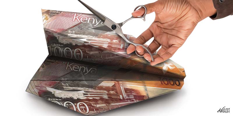
Can Central Kenya contribute 60 percent of Kenya’s GDP, as recently claimed, nay, asserted, by the region’s members of parliament? If 12 percent (old Central Province) or 20 percent (including Meru, Embu, Tharaka Nithi and Laikipia) percent of the work force is responsible for 60 percent of the economy, what does that say about the rest of the country. What would make Kikuyus or GEMA community four or five times more productive than other Kenyans?
The word “contribute” is a loaded one. It suggests that there is a common kitty called economy to which some people put in more than others. This is of course not the case. The economy is the sum total of the goods and services produced in the country. When Nyandarua grows potatoes that are consumed in Nairobi: which county has contributed more to the other’s economy? Neither—they have exchanged value, with each profiting from the other. The argument can also be a self defeating one. It justifies domestic import substitution. If we can champion “buy Kenya build Kenya”, why not “Buy Kilifi, build Kilifi”?
The word “contribute” is a loaded one. It suggests that there is a common kitty called ‘economy’ to which some people put in more than others.
The Central Kenya MPs are most likely to be under the impression that the region contributes more to the tax kitty. This is also a fallacy. The tax base and the economy do not overlap. Ideally they should but they do not. In an economy with our structure we have, a large informal sector and largely untaxed smallholder agriculture account for half the economy, the correlation between the economy and tax base is pretty low. The main sources of tax are profits, payroll taxes and consumption taxes (excise and VAT).
The Central Kenya MPs are most likely to be under the impression that the region contributes more to the tax kitty. This is also a fallacy.
The regions that contribute more to the tax base are those with larger corporatized economy. Though I do not have figures, I would expect the coastal counties to constitute a larger tax yield (revenue to GDP ratio) than central Kenya on account of high concentration of the corporatized economy— tourism, manufacturing, mining and logistics industry. The tourism establishments for example sell more highly taxed alcoholic beverages than consumed in central Kenya. They pay more VAT on food, and their employees pay PAYE which the presumably more productive and prosperous farmers of Central Kenya do not. If Central Kenya is so much more prosperous, the more pertinent political question would be whether it is paying its fair share of tax.
That cleared up, we can now turn to the question of county economies. Which counties have the strongest economies? The simple answer is we do not know. The Kenya National Bureau of Statistics (KNBS), the national statistics agency, only publishes national accounts for the whole economy. It is now publishing “County Statistical Abstracts” but these do not include GDP. Six years on, the counties have not found it worthwhile to measure the sizes of their economies even though this is part of their mandate, and it is not particularly difficult or expensive.
In response, I posted a graphic with two sets of figures of the relative size of county economies. One is an estimate of county GDPs computed by World Bank researchers, and published in a paper titled Bright Lights, Big Cities: Measuring national & sub-national economic growth from outer space in Africa, with an application to Kenya and Rwanda.
Which counties have the strongest economies? The simple answer is we do not know. The Kenya National Bureau of Statistics (KNBS) only publishes national accounts for the whole economy. It is now publishing “County Statistical Abstracts” but these do not include GDP. Six years on, the counties have not found it worthwhile to measure the sizes of their economies even though this is part of their mandate, and it is not particularly difficult or expensive.
This methodology is actually more technically sophisticated than it sounds. If one looks at a satellite image of earth taken at night, it becomes apparent that the night lights closely mirror the economic geography of the world. In fact, because the intensity of lights is captured accurately up to a square kilometre, they provide much more detailed geographical coverage than statisticians use to calculate national GDP. Moreover, night lights provide real time data while statistical samples can fall hopelessly out of date, as revealed by the latest rounds of “rebasing” which saw upward GDP revisions ranging from 13 percent in Uganda, 30 percent in Tanzania, to 90 percent in Nigeria. One only frowns at the night lights if they do not know what statisticians do in the kitchen. But as it turns out in fact that over time, the night lights estimate tracks the statistically estimated GDP growth quite well.
For the second series, I used household consumption expenditure shares from the most recent household budget survey data published by the KNBS, the Kenya Integrated Household Budget Survey (KIHBS 2015/16). This is the survey data that is used to measure poverty as well as to update the consumption basket used to calculate the rate of inflation. Household consumption expenditure is the largest component of GDP. Although the percentage is bound to vary from county to county, we have no reason to expect that to be very large. In general, survey data is more reliable than the methods used to estimate GDP, hence it provides a good check for the night lights data.
Another useful source of information is the relative size of a county’s workforce. In a fully integrated economy with free movement of labour and capital, the size of a region’s economy would be proportional to the labour force: if County A accounts for 5 percent of the workforce, then it should also account for 5 percent of GDP. This is because labour and capital will move to where the opportunities are until capital per worker, and in effect production per worker is the same across the whole economy.
Readers of this column may recall that I used this argument to respond to the urban legend, which still persists, that Nairobi accounts for 60 percent of GDP (people who make up numbers seem to like 60 percent). I argued that Nairobi’s GDP was at best between 15 and 20 percent of GDP. This was based on Nairobi accounting for 10 percent of the national labour force, and allowing for more capital than the national average. As we will see shortly, the estimate was overgenerous.
The conventional definition of labour force is population aged 15-64. Ideally, we should use actual participation rates because many young people between 15 – 24 are in full time education, and many older people also work full time, but this data is not readily available on a county by county basis. We will just have to assume that the youth and older people’s participation rates do not vary too much across counties. I use the data published in the Labour Force Survey Report 2015/16, which is part of the KIHBS 2015/16.
We want to see whether the three sources tell the same story. We call this research strategy i.e. cross-validating different data and methodologies, triangulation.
We are in luck. The three sources are remarkably consistent. The correlation between the night lights GDP and household expenditure is 70 percent, between the night lights GDP and labour force is 73 percent, and between household expenditure and labour force shares is 90 percent (see charts). The strong correlation between the night lights GDP and labour force shares tells us that the bright lights GDP is pretty good. We can conclude from these correlations that all these data are telling us the same story. What is the story?
 Second, all three tell us that Nairobi has the largest economy as expected, but it is a far cry from 60 percent. The night lights GDP puts it at 12.7 percent, while the expenditure share puts it at 20 percent. But the labour force share weighs in close to the night lights GDP at 12 percent.
The counties with the largest economies according to the night lights GDP are Nairobi(12.5%), Kiambu (11.1) Nakuru (8.5%). Between them, they account for 32% of the GDP.
The household expenditure data have the same order, and their combined share is also about the same (31%) but Nairobi’s share is much bigger (19.8%) while Kiambu and Nakuru are closer at 5.6% and 5.2% respectively. Eight other counties have large economies between 3 and 4 percent of GDP (Nyeri Kilifi, Kajiado, Machakos, Kwale Mombasa and Meru). With the notable exceptions of Nyeri and Kwale, their expenditure shares are also in line with the GDP shares. However, when it comes to the GDP and labour force, Kiambu, Kwale, Nyeri and Nakuru have much larger shares of GDP than their share of the labour force. I will come back to this shortly.
Nairobi has the largest economy as expected, but it is a far cry from 60 percent. The night lights GDP puts it at 12.7 percent, while the expenditure share puts it at 20 percent.
At the other end of the scale, Isiolo, Lamu, and Samburu have the smallest economies accounting for 0.2 percent of the national GDP each, followed by Marsabit, Tharaka-Nithi and Elgeyo Marakwet at 0.4 percent, Nyamira and West Pokot follow at 0.6 percent and Baringo and Tana River, 0.7 percent each, complete the ten smallest county economies. There is very close correspondence between the between the GDP and household expenditure in the small counties.
It’s worth pointing out here that the size of the county’s economy has no bearing on the incomes and well being. Whereas Lamu, Isiolo and Samburu are the smallest counties, Lamu’s incidence of poverty (28.5) percent is well below the national average of 36 percent; both Isiolo (56 percent) and Samburu (75 percent) are much higher. In fact, in terms of incomes and poverty Lamu, the smallest economy compares favorably with Nakuru, the third largest. This should put to rest those who are wont to argue that small counties are not economically viable. The Seychelles (Pop. 100,000, less than Lamu’s 130,000) has an average income ten times Kenya’s.
 What explains the large difference between Nairobi’s GDP and household expenditure share. Why are Kiambu and Nakuru’s GDP estimates so much larger than their shares of the labour force. Are there plausible economic explanations, or is it flaws in the data?
For Nairobi, cost of living is a plausible and likely explanation, in particular housing costs which are much higher than elsewhere. According to a national housing survey conducted by KNBS a few years ago, housing costs for house-renting Nairobi households take 40 percent of expenditures, a third more than the next highest, Mombasa and Kiambu, at 30 percent. Rural house renting households spent an average of 13 percent. Although the report does not give the percentages, we do know that Nairobi has a much larger percentage of renting households than other counties. Overall, 70 percent of urban households are renters, while 90 percent of rural households are owners. You would not know it from listening to Nairobi’s navel-gazing middle class going on about home ownership and mortgage interest. In aggregate 70 percent of Kenyans live in their own homes, and a good percentage of urban renters own decent debt-free rural homes. Home ownership is not a national priority, but I digress.
The large divergence of GDP and labour force shares is perhaps the more economically meaningful and insightful one. The straightforward interpretation of this observation is that the GDP per worker in Kiambu and Nakuru is considerably higher than average. Is this plausible? In the Census of Industrial Production conducted in 2010, Kiambu had 206 factories, second to Nairobi with 1090, out of a national total of 2252 establishments. In effect, Kiambu accounts for close to a fifth of the factories outside Nairobi. This is not a surprise given that Thika and Ruiru are large industrial towns, but even in my rural home I can count least six fairly large factories within shouting distance (4 tea factories, a chicken processing plant, and a dairy processor) and thats not counting the Bata shoe and a couple of other factories in Limuru town.
Nakuru may not count as many factories, only 95, but it certainly has a lot of capital. The country’s entire geothermal electricity industry, the flower industry as well as a very significant hotel industry around Lake Naivasha—that is a fair amount of capital. This ratio seems to be capturing, as it should, the capital intensity of the counties’ economy. If this is indeed what these data are telling us, then it is worthwhile to pay more attention to them, because they are conveying important information about the structure and character of the economy.
In the Census of Industrial Production conducted in 2010, Kiambu had 206 factories, second to Nairobi with 1090, out of a national total of 2252 establishments. In effect, Kiambu accounts for close to a fifth of the factories outside Nairobi.
If capital was evenly distributed across the country, all the ratios would be clustered around around 1. The actual ones range from 0.4 to 2.3. Kiambu’s ratio is the highest at 2.3 followed by Kwale and Nyeri (2) and Nakuru (1.9). There are three more counties with a ratio of 1.5 or higher, that is GDP share is 50 percent more than labour force share, Kajiado, Laikipia and Murang’a. Interestingly, Nairobi is not one of them. In fact, Nairobi is in the middle of the pack with a share just 10 percent higher, alongside Tana River. At the other end of the scale we have Elgeyo Marakwet and Nyamira with a GDP share which is 40 percent of the labour force share, and 12 counties where it is 50 percent. Looking at this pattern, it is readily apparent that the counties at the top are generally wealthier, while those at the bottom are poorer. The wealthier counties have more capital.
We have what looks like credible estimates of county GDP shares, we have each county’s labour force, and we also have the conventional national GDP. With these we are able to compute GDP per worker for each county, which will give us an idea which counties have the strongest economies. Kiambu comes out on top with a 2016 GDP per worker of Sh. 673,000. This is telling us that people in Kiambu produced on average Ksh. 56.000 worth of goods and services per person per month. The ten strongest economies are Kiambu, Kwale, Nyeri, Nakuru, Kajiado, Laikipia, Muranga, Garissa, Kilifi and Machakos.
 One of the striking findings is that the big city counties are not among the strongest economies.
Nairobi and Mombasa are about the same at 14th and 15th respectively with a GDP per capita of Sh. 300,000 and Kisumu is 16th with Sh. 263,000. Obviously Kisumu is both urban and rural – Kisumu City on its own would probably be comparable with Nairobi and Mombasa. Still, these data put some question marks on the widely held belief that big cities are the engines of economic growth. To be sure there could be other explanations. The cities, Nairobi in particular could have a larger share of young people in full time education and unemployed, but these are puzzles for curious students to write dissertations on.
One of the striking findings is that the big city counties are not among the strongest economies. Nairobi and Mombasa are about the same at 14th and 15th respectively with a GDP per capita of Sh. 300,000 and Kisumu is 16th with Sh. 263,000.
More significantly perhaps we also do not see an economically dominant region. Kwale’s economy compares favourably with Nyeri, both in absolute size and productivity. Kirinyaga sits next to Wajir in terms of productivity. Makueni is more productive than Nyandarua.
This is not to say that we’ve heard the last of central Kenya politicians’ ethnic chauvinism. As Bertrand Russell observed long ago, a man offered a fact that goes against his instincts will scrutinize it closely, and unless the evidence is overwhelming, refuse to believe it; but offered something which affords a reason for acting in accordance to his instincts, he will accept it even on the slightest evidence.